Artist’s Guide to the Color Index
If you’ve been around the artist paint world for any amount of time, you’ve likely seen or heard references to odd letters and numbers like PG7 and PV19 along with hard to pronounce names like Benzimidazolone Orange and Phthalocyanine Blue. If you’re not sure what all this means, we can help!
When choosing colors or building or modifying an artist palette, selecting from all of the beautiful colors that Da Vinci offers may feel confusing or overwhelming. However, the pigment color index can help artists learn more about the colors and pigments that they use and is also the answer to the mysterious code names like the ones above.
One important thing to note is that a pigment or dye’s color index information is not indicative of quality. Even if it was, the best artist paints aren’t made up of pigments alone, and the best pigments won’t necessarily make the best paints. Knowing how to formulate, mix, and process pigments and how to combine those pigments with the purest, highest quality of raw materials from around the world are all essential to the process of creating an exceptional artist paint. This is what Da Vinci Paints has focused on for more than 100 years and continues to focus on today. You can learn more about our story here.
In this blog post, we’ll explore what the color index is, how to understand it, and most importantly, why it’s relevant for all artists to know about the color index.
[Information in this article is adapted from the Colour Index™ at colour-index.com, published online by Society of Dyers and Colourists and American Association of Textile Chemists and Colorists.]
So what is the color index?
First published in 1924, the color index (or more accurately, the Colour Index™) is a standardized guide for all essential colorants used in commercial manufacturing. It uses a dual classification system that’s comprised of an assigned pigment or dye name along with a number — e.g. Acid Blue 37, Pigment Yellow 176, or Solvent Black 52.
However, the color index* is also a valuable reference tool for artists. Artist paints are primarily comprised of pigments, and these pigments have been classified by the International Colour Index and assigned a generic name and specific number that’s easily recognized.
Basically, the color index is simply a labeling system to help manufacturers of various goods, from the auto industry to clothing and much more, recognize the different colorants available for desired or needed applications. Again, regardless of a pigment’s color index, artists can rest assured that Da Vinci Paints only uses the highest quality of professional-grade ingredients, including pigments, in all of our paints.
*When not referring to the specific organization, most artist paint companies refer to the color index as a common noun. To keep things simple, we’ll do the same in this article.
How to Read the Color Index

All Da Vinci artist-grade paints have a series of color index letters and numbers like PR254 or PBr7 that are listed on every tube, at each product page at our website, and on all Da Vinci Paints’ color charts and technical information (located here). Each one of these letter and number combinations represents a single pigment index, so when listed on a tube, artists can know that this is the exact pigment index that was used to create a particular Da Vinci color.
However, some Da Vinci colors contain more than one pigment and will have multiple index codes listed on its tube and at its product page. For example, Da Vinci Sap Green watercolor contains two pigments — the color index assigned name of Pigment Green 7, which is abbreviated to PG7, and the color index name Pigment Yellow 42, or PY42.
The color index letter abbreviations for artist pigments will often lend a clue to the color of the paint, but not always. However, these abbreviations are a good general guide.
PB - Pigment Blue
PBk - Pigment Black
PBr - Pigment Brown
PG - Pigment Green
PO - Pigment Orange
PR - Pigment Red
PV - Pigment Violet
PW - Pigment White
PY - Pigment Yellow
Why are there variations between colors made with the same pigment(s)?
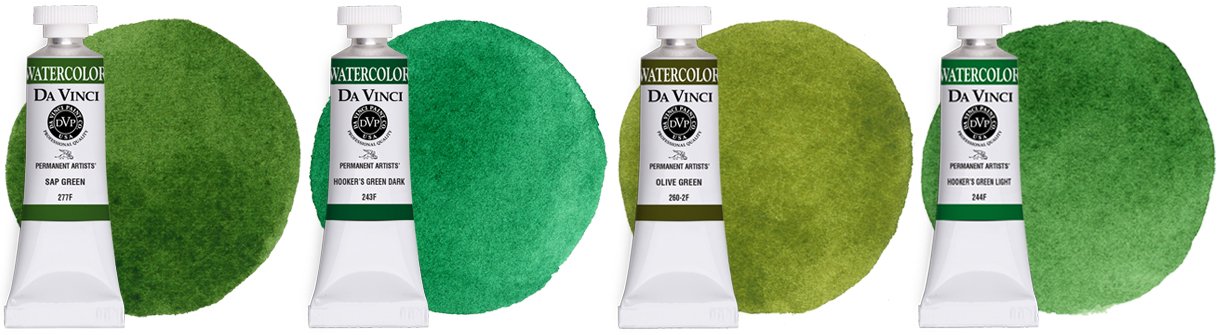
All of these Da Vinci artist colors are carefully formulated with varying ratios of PG7 & PY42.
Let’s take a look again at Da Vinci Sap Green watercolor which contains multiple pigments. Da Vinci Paints also offers several other shades of green that are comprised of the same pigments like Olive Green, Hooker’s Green Light, and more. However, varying ratios of each pigment in a color mix will result in a different color — just like if you mixed these two pigments on your own.
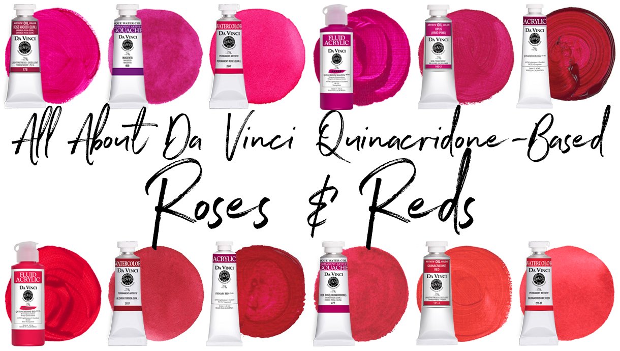
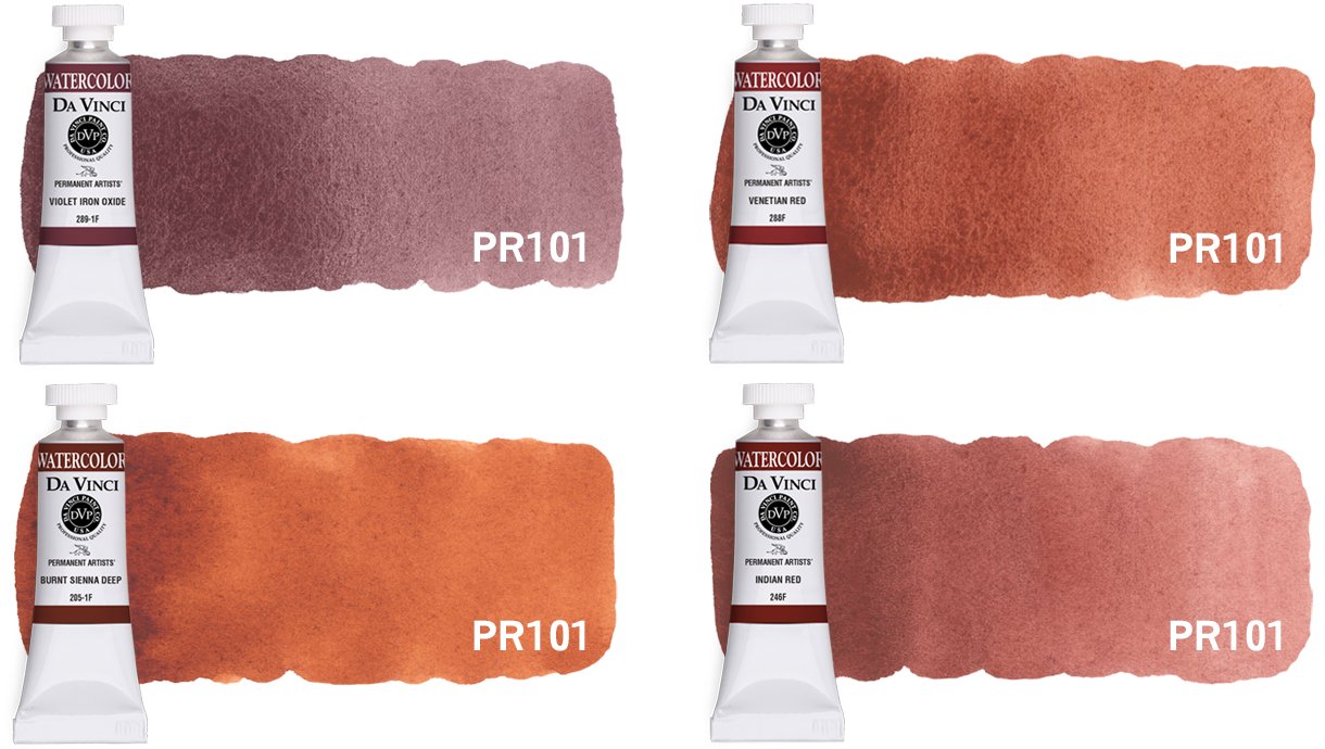
Now let’s look at a single-pigment color example. In this post’s header photo, one can easily see the many shades of single-pigment paint colors made with Pigment Red 101 (PR101). Because the Colour Index primarily classifies pigments based upon their chemical characteristics, not necessarily their colors, each family or index of colors can contain a variety of hues. For example, Pigment Brown 7 (PBr7) in Raw Sienna is the same chemically as the PBr7 in Burnt Sienna, but treatment during the manufacturing process* results in a different coloration without affecting chemical structure.
Therefore, various treatments of the same pigment along with different pigment ratios in Da Vinci paints result in an exciting variety of hundreds of colors for artists to explore!
*Just in case you’re curious, the PBr7 that’s commonly used in Raw Sienna is naturally a light, warm brown. But just like when you’re toasting bread, Raw Sienna’s PBr7 when heated or “burnt” changes into a deeper, more reddish brown which results in the color that we commonly call Burnt Sienna.
Why is the color index helpful to artists?

Along with pigment information, we also share additional information about each Da Vinci artist paint color at our website, DaVinciPaints.com.
Paying attention to the color index listed on each Da Vinci paint color can be helpful because it can enable an artist to explore new colors and pigments, simplify their palette, and/or avoid color duplication. However, there are many more advantages to understanding and recognizing the pigments in your favorite Da Vinci paints, as well.
Each pigment is very unique in how it reacts when painting. For example, pigments have different tinting strengths, and some pigments are more transparent while others are more opaque. Certain pigments have the ability to granulate in watercolor, and others have strong staining power. In oils and acrylics, it’s also helpful for artists to know which pigments tend to have shorter or longer drying times.
A pigment’s characteristics can have a big impact on your painting, but don’t get bogged down in all of this. Most artists learn pigment characteristics by exploring the pigments that are in their most commonly used colors and then painting with them — which is what this knowledge is really all about!
It’s also good to know that, unlike a pigment’s color index, color names are not standardized between paint companies and brands, and often not within the same company. For example, Da Vinci Green Gold watercolor is created with Pigment Yellow 129 (PY129) while Da Vinci Green Gold fluid acrylic is carefully crafted using Pigment Yellow 150 (PY150) and Pigment Green 36 (PG36). Instead, Da Vinci paint color names are often chosen for various reasons like a reflection of what the color appears like (e.g. Seaglass) or to represent a modern adaption of a historical color (e.g. Alizarin Crimson).
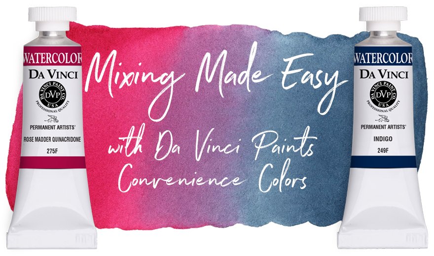
Last but not least, taking a final look at Da Vinci Sap Green, it’s also helpful for an artist to know that if they already have PG7 and PY42 in their palette, they’ll likely be able to mix a variety of greens for themselves. However, these wonderful multi-pigment “convenience” colors can offer artists a palette full of effortless color! You can learn more about the benefits of convenience colors at this post.
Is there a common, universal name for each pigment?

Click on the image to discover in-depth color information at the Da Vinci Paints’ Resource webpage at our website.
There are other specific names and numbers assigned to colorants to further categorize and recognize the various pigment and dyes available, but for nearly all artistic uses, the information that we share at DaVinciPaints.com gives artists all they’ll need to make wise palette choices. If you’re highly interested in each pigment’s chemical structure and more, the International Colour Index is available online, and artists are welcome to explore more information at their website.
Although the common names of pigments are somewhat separate from the color index, the more familiar or common names of pigments are oftentimes helpful to know or at least be able to recognize. Even if you’re a beginning artist, you’ve probably become accustomed to many of these names already, if only in their abbreviated form. For example, Pigment Blue 15 (PB15) is also known as Phthalocyanine Blue, but it’s commonly referred to around artist circles in its abbreviated forms of Phthalo Blue or Thalo Blue. Many of these common names reflect the pigment’s molecular structure or makeup. For an example, please refer to our post on Quinacridone Roses & Reds.
We share each pigment’s commonly recognized universal or chemical name alongside the color index information on all Da Vinci paint colors in the technical charts located at our resource webpage. Here, you can also download color charts and discover more information to help you make informed and fun choices about your favorite Da Vinci colors!
SUBSCRIBE TO DA VINCI PAINTS
Receive notifications of new posts & promotional offers.
Da Vinci Paints never shares subscriber information.
We'd love to see what you create with Da Vinci Paints! Be sure to follow & tag us on social media.
@DaVinciPaints #DaVinciMoment