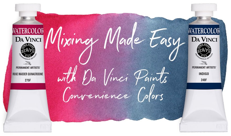
Mixing Made Easy with Convenience Colors
There are as many different artists and ways to create art as there are colors in the world. Some artists are staunch advocates of a limited palette and enjoy the challenge, fun, and results of mixing most of their colors. Other artists, sketchers, and art journalist prefer or need to include a few convenience colors in their palettes for various reasons. And many others see no reason to limit themselves and keep a palette or cabinet full of colors and use them all.
For those unfamiliar with the term, a convenience color is a paint mixture made up of two or more pigments. Although Da Vinci Paints offers artists a wide variety of single-pigment colors, many of the colors that we create at Da Vinci Paints are considered “convenience” colors. There’s a reason for this term. For many artists, premixed colors are very convenient to use and greatly enhance the joy of painting.

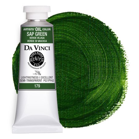
Da Vinci Sap Green Artist Watercolor is a carefully crafted convenience blend of two popular pigments, Pigment Green 7 (PG7) & Pigment Yellow 42 (PY42).
At Da Vinci Paints, we celebrate all colors of all pigments, shades, and hues, so we thought that we’d share ways to embrace and adapt convenience colors for your own use. Whether you paint best with a limited palette or enjoy the convenience of premixed colors, we hope these ideas inspire you to be open to new colors and ideas and, most importantly, grant yourself the freedom to experiment and play with paint!
Da Vinci Paints includes complete pigment information on every tube and product page along with lightfast ratings. Whether it’s a single-pigment color or a convenience blend, when you use Da Vinci paints, you can be assured that you’re always using the highest quality artist-grade paints.
The Benefits of Convenience Colors
All Da Vinci artist colors are carefully crafted to be beautiful straight from the tube and also perform extremely well in mixes.
There are likely as many benefits to using convenience colors when painting as there are artists. Premixed or convenience colors can be a huge help to those who have limited time to paint or haven’t yet honed their mixing skills. Multi-pigment blends can also be used to provide artists a nontoxic option of a well-known color or be used to replicate a pigment that’s no longer being manufactured.
Regardless of these common reasons and the fact that artists could mix most convenience colors for themselves, many choose to embrace convenience colors simply because they love color and see no reason to limit themselves to the basics. Sometimes convenience colors can even help artists limit their palette colors. For example, instead of keeping all three colors of a favorite blend in a palette, artists can opt to keep one premixed convenience color instead which can be a very economical solution.
Choosing Convenience Colors
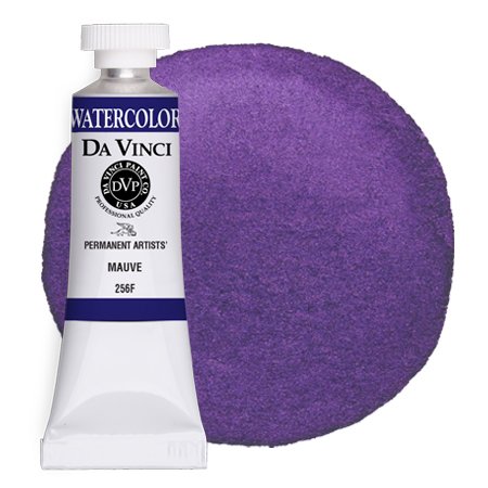
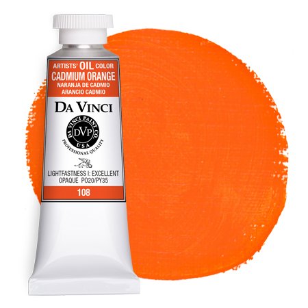
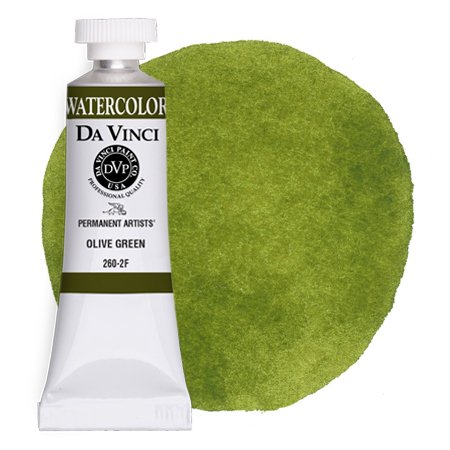
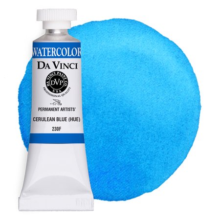
Although some multi-pigment blends like Da Vinci Aureolin or Bright Red in watercolor, Cerulean Blue Hue in oil, and acrylic colors like Primary Yellow or Cadmium Red Hue can be excellent palette primary colors, the most popular convenience colors are secondary colors like greens, violets, and oranges. However, due to the fact that mixing neutrals like black and gray can be somewhat difficult and tedious, these colors are also very popular convenience colors. If you’re new to painting and mixing, these easy-to-manage and common convenience colors are a great place to begin.
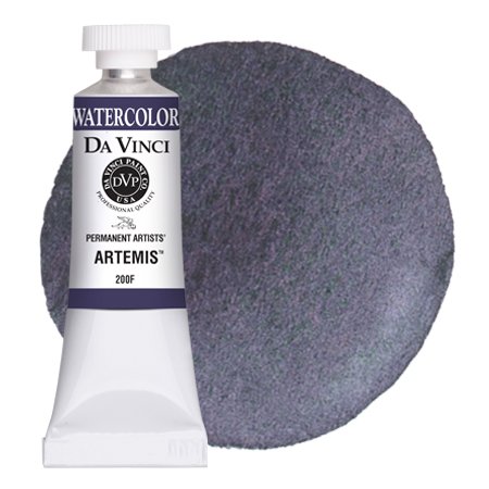
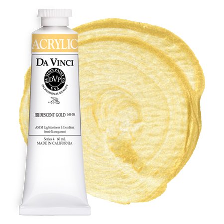
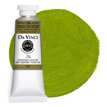
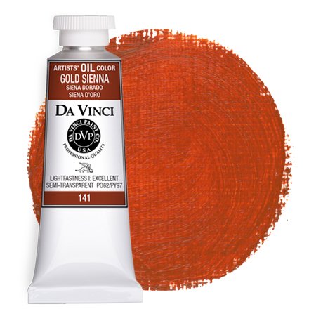
If you’re interested in adding a bit of punch to your palette, convenience colors can also be a wonderful way to explore really exciting and unique pigment combinations. In watercolor, colors like Da Vinci Artemis and Joyce’s Mother Violet were created to produce unique effects on paper. In oils, Naples Yellow, Cinnabar Green, and Gold Sienna can add a lot of interest to a painting. Da Vinci’s iridescent colors can also be a fun way to add interest and pop to a painting. Because of the extremely high quality of Da Vinci paints, all of these colors will also perform well in mixes.
The images above are only a small assortment of the many professional-grade convenience colors that Da Vinci Paints offers. Click on any of the images above to learn more. If you prefer single-pigment options, Da Vinci Paints also offers plenty of choices for single-pigment secondary colors as well as single-pigment blacks and whites.
Mixing with Convenience Colors

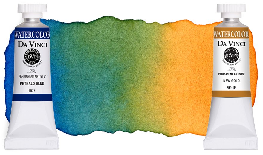
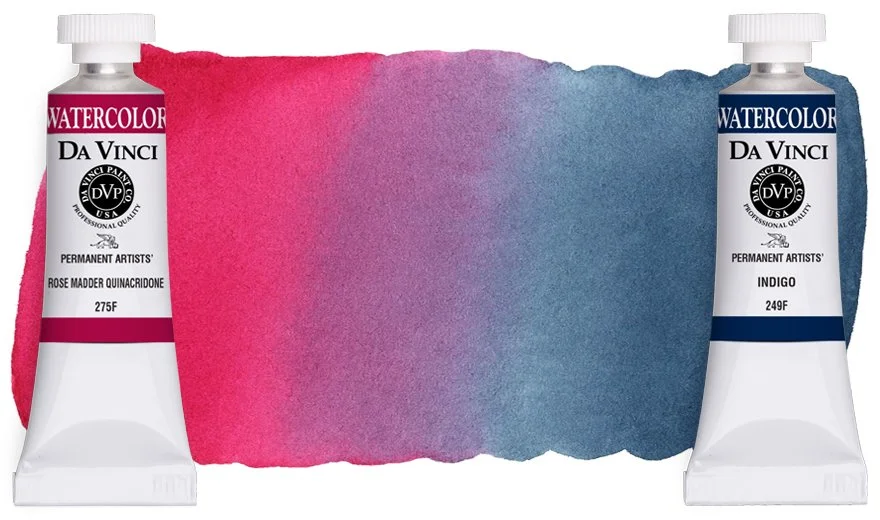
An example of how one can use a convenience color to quickly create a variety of different shades.
All Da Vinci Paints’ multi-pigment colors can be used straight from the tube, but artists often use these colors as starting points or shortcuts for their own personal mixes. For example, it’s easy to shift a convenience color to a warmer or cooler version by adding a touch of blue, yellow, or earth. This can be especially useful with many convenience greens, making tube greens an easy and fast jumping off point for mixing natural greens.
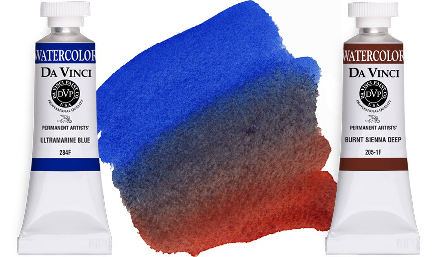
Convenience blues and violets can also be quickly blended to create depth and drama when painting a sky, landscape, or water. Although orange is an extremely useful color by itself, it’s also an excellent starting point for warming and deepening palette colors and mixing earths and darks.

A convenience neutral like Da Vinci Ivory Black (PBk6/PBk9) can be used to quickly darken, soften, and shift single-pigment and multi-pigment palette colors.
Not only are multi-pigment neutrals great for quickly dropping in shadows or dark areas in a painting, but they’re also useful in color mixing for toning or reducing the chroma or intensity of other palette colors. This can be a great aid for increasing color interaction in a painting and also for adding and enhancing mid-tone values.
There are other reasons that dark and neutral convenience colors are popular, especially in oils and acrylics. Adding black or neutral to another color will often change the hue into a completely different color; this greatly expands a palette’s available color options. For example, adding gray or black to certain yellows will actually create a range of greens, and adding black or gray to orange can create a beautiful variety of earths.

Mixing multi-pigment colors doesn’t necessarily make mud. Instead, the results can be surprisingly beautiful!
Speaking of values, a common misconception when mixing with convenience colors is that “too many pigments make mud,” meaning that the mixed result can be a color that appears strikingly similar to mud. However, most artists will attest that it’s possible to muddy colors in a painting with only a small palette of pigments. Mud shouldn’t be confused with brown: A muddy color or appearance usually happens when the mix or color becomes too desaturated and has a dull, flat look. “Mud” in a painting results in a lack of value and is often caused when one loses control of the process and/or overworks their palette colors or painting.
The best ways to avoid muddy colors are to choose quality materials and to practice mixing and painting techniques using the colors in your palette. If you do these two things, you’ll quickly learn what the results will be when you mix two or more colors together, regardless of the number of pigments.
These are just a few, simple ideas to get you started with convenience colors. If you’ve been hesitant to add multi-pigment hues to your palette, we hope this inspires you to consider convenience colors as a creatively fun option!
SUBSCRIBE TO DA VINCI PAINTS
Receive notifications of new posts & promotional offers.
Da Vinci Paints never shares subscriber information.
We'd love to see what you create with Da Vinci Paints! Be sure to follow & tag us on social media.
@DaVinciPaints #DaVinciMoment