Embrace Opacity with Artist Denise Soden
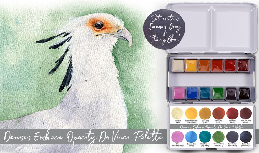
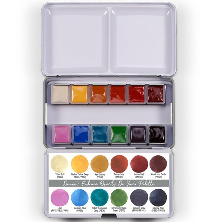
Da Vinci Paints is delighted to introduce a new, custom-curated watercolor palette by Ambassador Artist Denise Soden that Denise has titled “Embrace Opacity.” This unique 12-color collection contains semi-opaque to opaque colors that have been carefully chosen to work together and can also be combined with other Da Vinci Artist Watercolors.
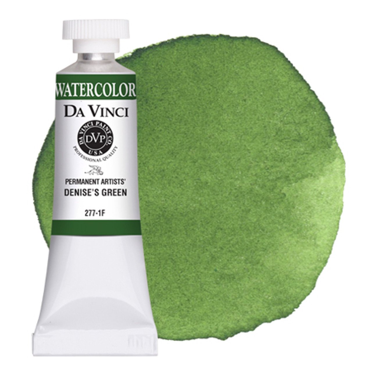
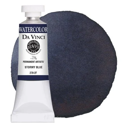
Denise’s Embrace Opacity watercolor palette is an appealing combination of earth yellows, oranges, and reds alongside complementary shades of blue, teal, and green. In addition, Denise’s Embrace Opacity palette contains two of Denise's custom colors, Denise’s Gray and Stormy Blue.
“Many new artists are instructed to avoid opaque watercolors because they can cause muddy mixes, so it can take years for artists to discover the beauty in these often overlooked pigments. While some craft-grade watercolors can be opaque due to chalky, low-quality fillers, the professional watercolors in this set contain naturally larger and denser pigments than those found in transparent watercolors. This quality makes these colors useful for creating soft, velvety textures and results in a unique painting experience that one can’t find in transparent watercolors or gouache alone.” -Denise Soden
Learn more about Denise’s Embrace Opacity Da Vinci Palette below and at our main website.
Note: Denise’s Gray and Stormy Blue are currently available in Denise’s Embrace Opacity Da Vinci Palette but will be offered in 8mL and 15mL tube sizes beginning in January 2023.
The Allure of Opacity
Not to be confused with gouache, opaque watercolors are created with pigments of a certain particle size that refract light in a way that gives the color more visible body and hiding power, simply by virtue of its pigments. Watercolors that are crafted with more opaque pigments, like those found in Denise’s Embrace Opacity Da Vinci Palette, can be extremely useful when painting and grant artists many more palette options.
Although watercolors made with opaque pigments may be used similarly to gouache, the high quality of Da Vinci Artist Watercolors means that even naturally opaque colors can be diluted easily for traditional watercolor effects; for example, for use in glazing or creating effects with granulation and blooms. Embracing opaque pigments allows artists to advantageously utilize transparency and opacity in paintings which can result in a field of depth that is hard to achieve with transparent pigments alone.
Denise’s Embrace Opacity Palette
Unlike a traditional split primary palette, Denise curated a unique collection of 12 complementary colors that create warmth with the use of Naples Yellow Deep, Terra Cotta, and Cobalt Turquoise Deep while balancing these choices with cooler options like Violet Iron Oxide, Cerulean Blue Genuine, and Chromium Oxide Green. Denise also chose Titan Buff to soften palette colors and create pastels in mixes, while Denise’s two custom colors, Denise’s Gray and Stormy Blue, provide a new and exciting choice of neutrals and darks.
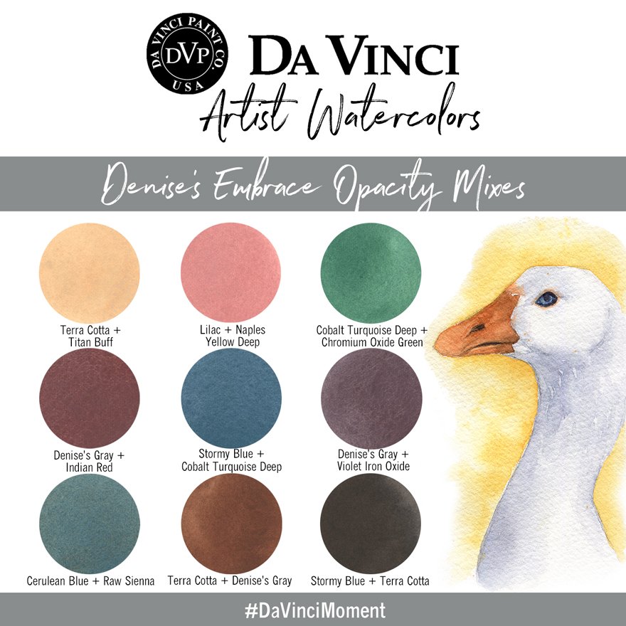
Denise’s Embrace Opacity Palette Mixes
Denise's Embrace Opacity palette proves that opaque watercolors perform exceptionally well in mixes, and resulting mixes can impart a richness and depth of color and texture that is lacking in many transparent colors. The misconception of "muddy colors" with opaque mixes is most likely due to the choice or ratio of colors mixed, not necessarily the pigments themselves. Opaque to semi-opaque watercolors such as cadmiums, cobalts, and various earths have a prominent history among artists and are still among the most commonly used pigments by artists today.
Palette Bonuses! Denise’s Gray & Stormy Blue
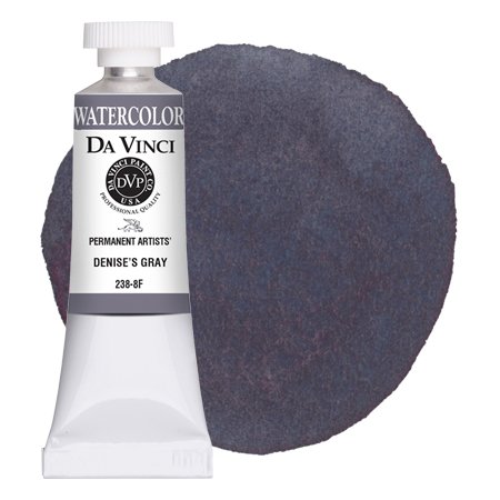
Denise worked with Da Vinci to create Denise’s Gray, a semi-opaque neutral that is calmly cool yet displays an attractive, contrasting warmth through granulation. Denise’s Gray can be diluted at various levels to create a vast range of neutrals and realistic subject and shadow colors, while Denise’s Gray is also fantastic in mixes for adding atmospheric coloration.
Denise’s other custom color in this palette, Stormy Blue, can appear as an opaque blue-black in masstone but softens easily in washes to a transparent midnight. Stormy Blue is fantastic as a solo color but is also extremely useful in mixes for cooling and darkening other palette colors.
Currently, Denise’s Gray and Stormy Blue are available in Denise’s Embrace Opacity Da Vinci Palette but will be offered in 8mL and 15mL tube sizes beginning in January 2023.
All artwork created by and belongs to Denise Soden. Used with permission.
Explore Denise’s Da Vinci Sets & Colors
Once again, Da Vinci Paints is honored to partner with Ambassador Artist Denise Soden to create this one-of-a-kind palette. Click on the images below to explore and shop Denise’s complete collection of custom-curated Da Vinci products at our website. To learn more about Denise, visit her website.
SUBSCRIBE TO DA VINCI PAINTS
Receive notifications of new posts & promotional offers.
Da Vinci Paints never shares subscriber information.
We'd love to see what you create with Da Vinci Paints! Be sure to follow & tag us on social media.
@DaVinciPaints #DaVinciMoment

